Rebranding 101: Essential Resources for a Successful Brand Makeover
A rebrand is necessary in your business when you make strategic shifts in your business model, offerings or target audience.
There are several reasons for rebranding:
- You implement changes to your strategic direction, offerings or business model
- If you’re struggling to gain a competitive advantage, attract talent or have faced negative brand perception
- You feel your brand doesn’t reflect your brand’s vision, values or doesn’t help you distinguish yourself in the market
- Your brand no longer resonates with your target audience or you feel like you’ve outgrown your brand
Rebranding may be necessary because of changes in your offerings, expanding into a new market or audiences or if your brand evolves.
In this article, I will share some essential key resources you’ll need for a successful rebrand, including logo design, brand style guide, font choices and other tips on leveraging them effectively as you rebrand your business.
Logo:
Your logo visually represents your brand and is an essential part of your business. It will help your business be discovered, distinguish you in the marketplace and help your customers recall your brand. Your logo should reflect your company’s identity and relevance in the industry.
You’ll need a primary logo, secondary logo and submark. These logos can be used on your website, printed materials, packaging, graphics or other marketing materials.
Logo variations help you have some options when placing your logo on materials that may need horizontal or vertical placements or different colors. Your logo may have different colors and sometimes a black or white logo may be needed.
- Primary Logo: A primary logo is the most prominent version of your logo and usually features your company’s name, iconography and tagline, if applicable.
- Secondary Logo: A secondary logo can be used when space constraints exist and certain branding details are re-arranged or removed to help maintain brand recognition. A secondary logo maintains the integrity of your brand, while offering a more versatile logo that can be used on small marketing materials such as social media account icons or promotional products.
- Submark: A submark is a more simplified and compact version of your logo and is often a single symbol, icon or brand initials or monogram. Submarks can be used where space is limited such as your website’s favicon, stamp or a watermark on designs.
Check out these logo options for your brand refresh:
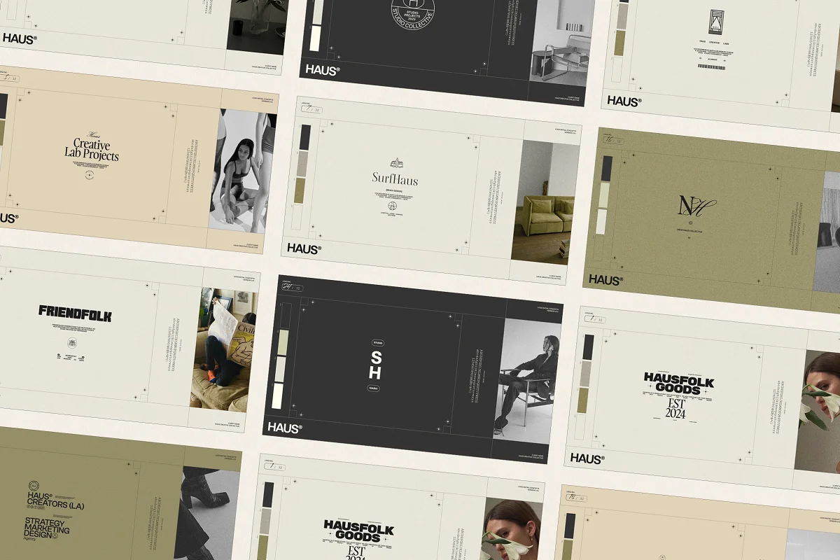
HAUS | Logo Kit
This HAUS Logo kit has 32 fully customizable, easy-to-edit pre-made logo templates. You can create your logo by replacing the placeholder brand with your brand name and swapping in your brand colors using Adobe Photoshop or Illustrator.

Freyja | Logo Kit
The Freyja Logo kit has 24 fully customizable, easy-to-edit pre-made logo templates. Create your brand logo by simply replacing the placeholder brand with your brand name and brand colors.
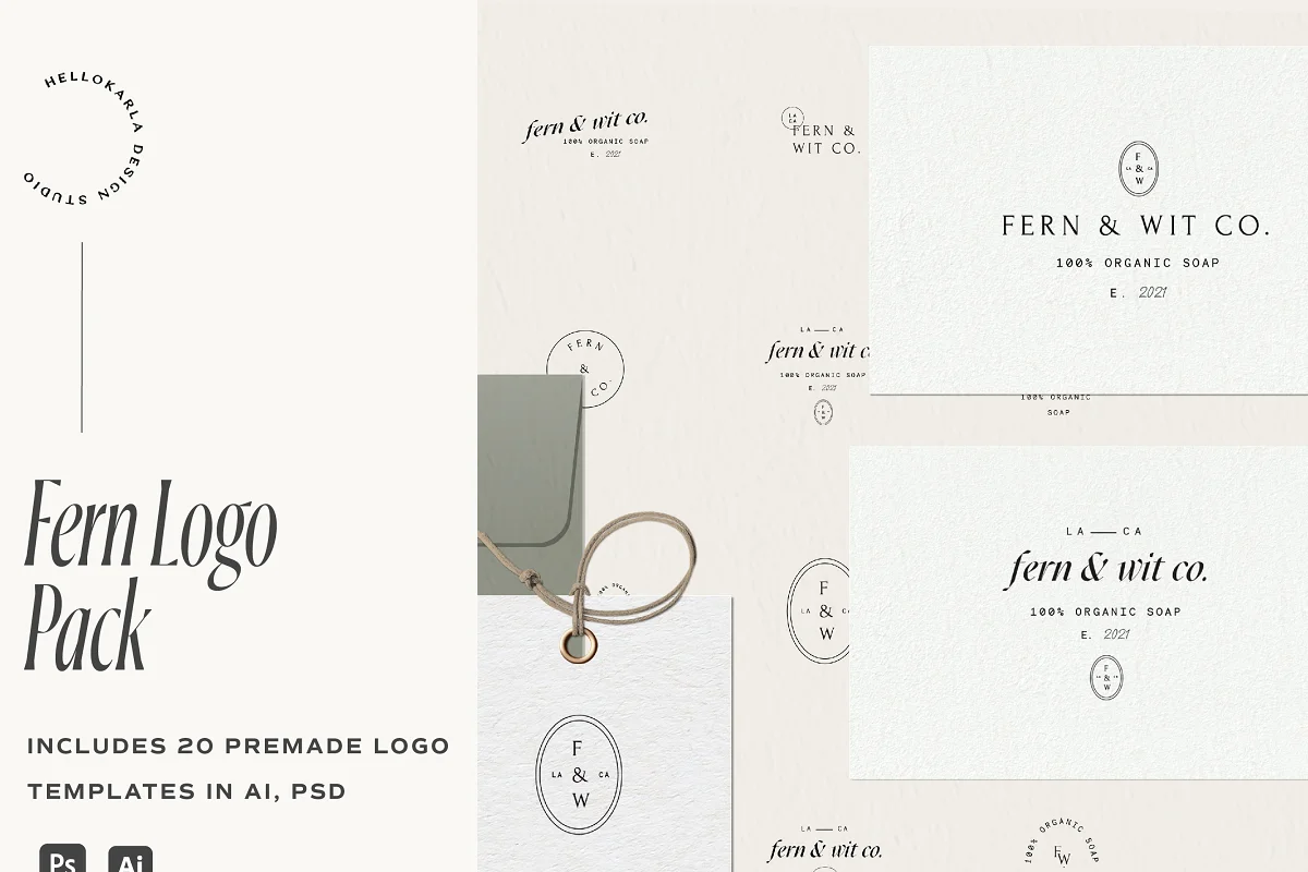
Fern Minimal Logo Pack
The Fern logo pack has 20 fully customizable, minimal pre-made logo templates. These logos are perfect for anyone looking for a modern, minimal and professional logo for your brand or a client. This logo pack includes primary and secondary logos, monograms and sub-marks variations.

Font:
You’ll also need to identify the font you’ll use for your brand. Choose a font that helps convey your brand’s personality and align with your values and target audience. You’ll want to ensure you choose a legible font that creates a cohesive and memorable brand image.
- Primary Font: Your primary font will be the main font you use in your logo, headlines or other brand elements. This font should embody your brand’s personality and be highly readable.
- Secondary Font (Optional): Your secondary font is used to add variety to your brand’s identity. You can use this font for subheadings, captions or other text elements. Make sure your secondary font complements your primary font. You might use this secondary font for quotes or other stylized text on your website or designs.
- Accent Font (Optional): You might also incorporate an accent font for certain designs, quotes or to complement other design elements. Your accent font is used sparingly.
In general, it’s okay to stick to 2-3 fonts to maintain brand consistency and help your brand have a cohesive look.
Check out these fonts that you can use for your rebranding efforts.
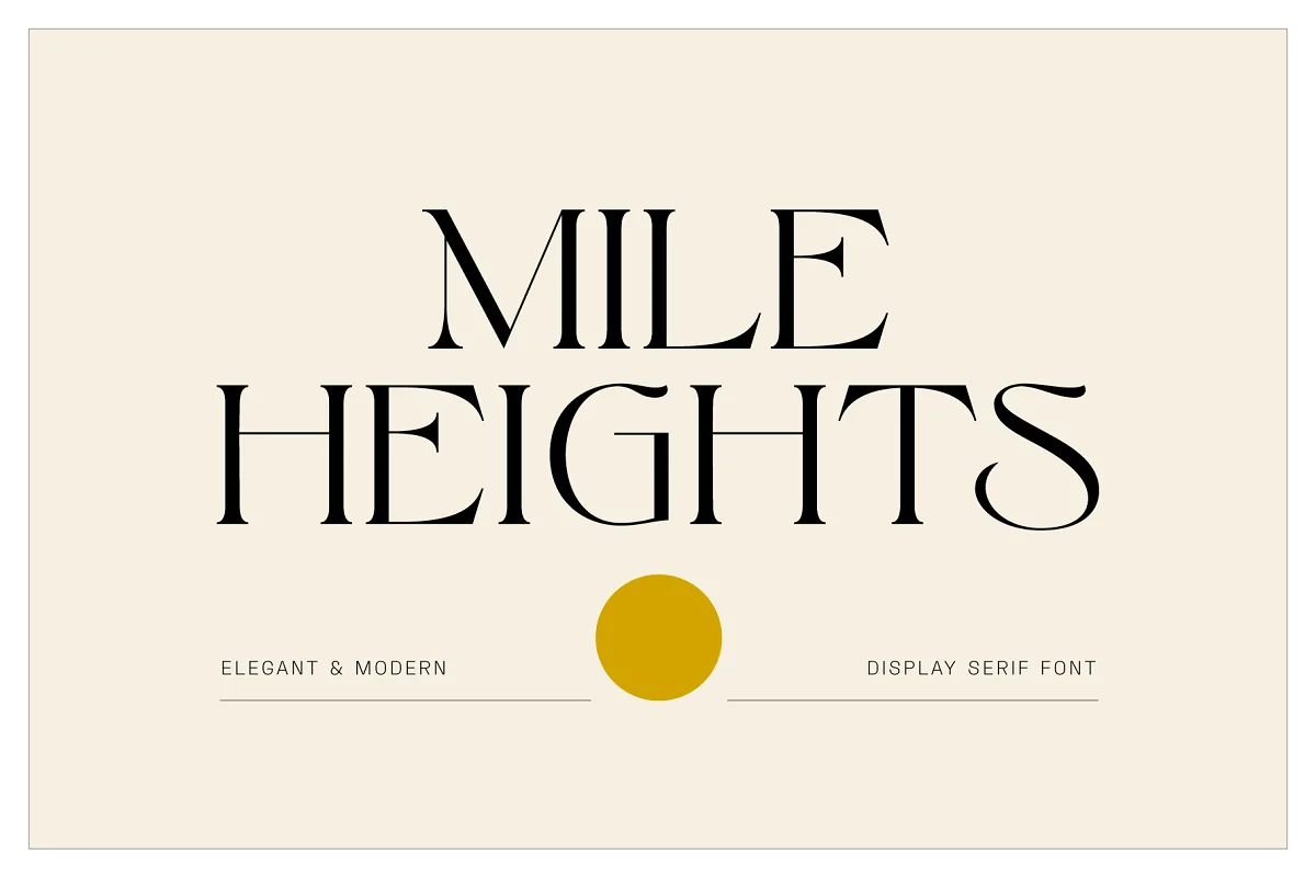
Mile Heights – Elegant Display Serif
The Mile Heights is an elegant and modern display serif typeface with unique characters that will make your work stand out!
This font comes with custom alternate characters and ligatures making this product perfect for creating logotypes and wordmarks, editorial designs, stationery, product packaging and so much more.

Pristinia An Impactful Duo
Pristinia Duo is a powerful fancy and impactful bold mono-lined script font that comes in with a clean all-caps sans serif font that makes a great harmonious pair.
Pristinia Duo is perfect for branding, web headings, logos, quotes, titles or packaging.

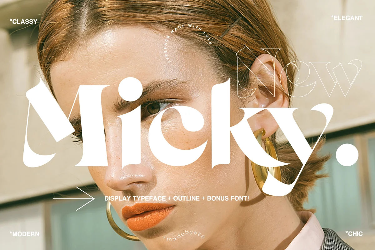
Micky Display Typeface
Micky is a fearless and chic typeface perfect for big headlines for both print and web. You get the Micky regular font, a font outline and a sans font to help you create stunning and original layouts.

Brand Guidelines
A brand style guide helps you establish a strong and consistent brand identity.
This document will be essential as you rebrand your businesses because it will help you capture all of your brand’s personality and identity into this living document. Your brand guidelines document contains your color palette, voice and tone, messaging style, tagline and any other guiding principles that help communicate your brand through print or visual assets.
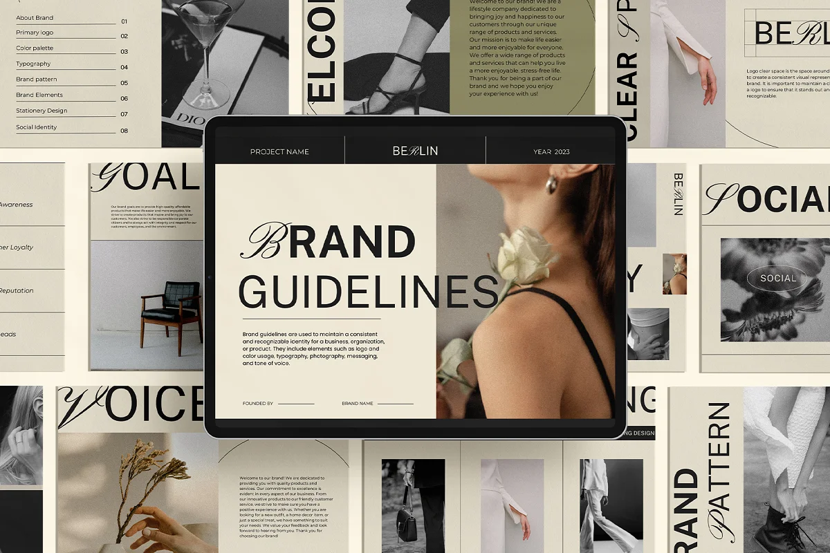
BERLIN Brand Guidelines Template
This brand guidelines template includes everything you need to create comprehensive brand guidelines, including a logo page, color palette, typography, brand pattern, brand elements, stationery design, about brand section and brand voice guidelines.

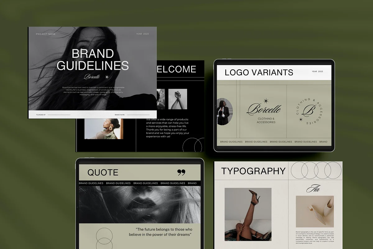
ATLANTA Brand Guidelines Template
Our Brand Guidelines template is an all-in-one solution to help businesses and organizations establish a strong and consistent brand identity. It includes everything you need to create comprehensive brand guidelines, including a logo page, color palette, typography, brand pattern, brand elements, stationery design, about brand section, and brand voice guidelines.

Embarking on a rebranding journey is a strategic move that can breathe new life into your business and propel it towards success by allowing you to more effectively communicate your brand’s values, messaging and create a memorable brand experience.
The essential resources discussed in this blog post—logos, fonts, and brand guidelines—serve as the cornerstone of a cohesive and compelling visual identity.
Remember that rebranding is not just a visual facelift—it’s a strategic investment in your brand’s future.
Whether you are refining your existing brand elements or starting fresh, the thoughtful use of logos, fonts and brand guidelines ensures that your visual identity aligns seamlessly with your brand narrative.
